created by Phoebe A

13 Mar 2010

More shadowy subjects by Phoebe A


Fracture by Phoebe A


Drawing Dogs


A small project recording the movements of my dog, Buffy the weineramer, around the house.

8 Mar 2010

Site Specific


Top & bottom photographs: Tilted Arc, Richard Serra, 1981 (Federal Plaza, NYC)

Richard Serra's Tilted Arc attempted to reinforce the 'art in public places' approach New York was experimenting with in the 1980's.

..."the controversial sculpture showed up the hypocrisy of the "public" plaza as a cohesive and unified social space by negating the utilitarian or functionalist mandate for public art with an obtrusive and "useless" object..."

It was a monument that caused huge controversy (how could it not!), so much so that immediately after its erection a trial commenced, to decide whether it should be taken down. 8 years later it was cut into three and removed from the Federal Plaza, where it was taken to a scrap yard. The discrimination against this sculpture provoked many questions regarding the role and freedom of the artist in an increasingly liberated society, government funding and the publics role on deciding the value of art.

Seized by Seizure!


Roger Hiorn
157 Harpers Road
SE1

Hiorn has transformed a less than ordinary, unloved, urban space into a surreal fantasy. In the early twentieth century, a german artist named Kurt Schwitters radically turned his family home into a "gothic labyrinth of the imagination".
This is certainly a very worthwhile moment in modern British art!

Marlene Dumas


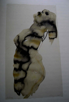
Marlene Dumas; Watercolour Series

Does Dumas transform people into painting, or does she transform her paintings into people? Do watercolours create individualised forms of human expression or is the audience looking at the transformation of the uniqueness of the human being into an abstract concept?
She is certainly more a sensualist than a painter, using watercolours to lend the figures their dreamlike transparency. For me it is in the characteristic application of the paint it’s contouring which transforms the body language of the figure into a metaphorical language. In this practice, the sensual power of expression adopted in Dumas paintings is perceived by the audience as an unpredictable confrontation.

Are we becoming a faceless society?


John Stezaker re-examines the function of the photographic image. As an audience, we rely too much on the photograph to represent the truth, and Stezaker encourages the audience to look beyond the facade of the image in his work. Using Marcel Duchamp's 'ready-made' method of art practice, Stezaker appropriates images from magazines, books and postcards to conceal the identity of his subject.

Jeff Wall


Top: The Destroyed Room, 1978
Bottom: After “Invisible Man” by Ralph Ellison, the Preface

Rubric of the Spectacle

The Situationists


'The Naked City'; Guy Debord, 1957

This is Debord's fragmented map of Paris emphasising the key concerns of the 'Situationist International' (SI), "particularly around construction and perception of urban space". By rearranging this urban terrain, Debord encouraged the average "imbecile" to engage in a deeper understanding of Paris as an aesthetic, political environment.

The SI were a group of international revolutionaries established in the late 1950's with ideas influenced greatly by Marxist thinkers and avant-garde artists. They attempted to discourage social alienation caused by capitalist order, by constructing 'situations' so that an element of passion could be injected back into the city. In their attempt to reify bohemian culture, they provoked the government to take action by supporting the revolts in May 1968 and encouraged workers to occupy the factories and demand direct democracy. Society of the Spectacle is one of the most important pieces of work established by the SI, and Debord himself was the most significant intellectual in the situationist group. Society of the Spectacle insinuates that society presents a fake representation of itself to the masses through media and advertising, to mask the ugly reality of a downward spiralling capitalist society. So 'The naked city' represents a deconstruction of the city, in order to promote looking at urban space through a different perspective.

4 Mar 2010

The process of compression


Going back to what I was yabbering on about how photography compresses the 3D object to a 2D image, here is a man who did just that in a more literal sense. In 2001 Michael Landy presented 'Breakdown', a performance-cum-installation piece exhibited at the old C&A building in London. He demonstrates a radical rebellion against consumerist capitalist society by destroying everything he owns, and crushes them flat.


Tiny interiors


Top: Set Design I at the Musée international de la Miniature; Phoebe A
Second down:Set Design II at the Musée international de la Miniature; Phoebe A
Third down: Thomas Demand
Bottom: Thomas Demand

Thomas Demand patiently creates miniature interiors using coloured paper and cardboard, to then photograph. I went to the 'Musée international de la Miniature' in Lyon and photographed some of the mini set designs they had exhibited there...

The Organisation of Dirt!

So it seems that I am using this plot of land to explore the function of space, (with a few interjections of my own work, and work I find interesting). The concept of 'space' is invaluable to the artist, as it is the medium in which ideas can be visually phrased. The idea of creating a "synthesis of visual art and language" is significantly related to installation art as being both a presentation and social comment. Showing, after all, is telling.

'Fluxus' and 'Situationist' art. Neither of which are specific art movements, however they both evolved alongside the development of a new art culture and innovative perspectives in art, so in this respect they can be defined as an 'attitude'. Both repel mass culture, and are therefore disapproving of 'presumed' art, so situationist art strove for a total dissociation from museum culture to become a unique art of interaction.

But what is the situation in situationist art? It is the realisation of a better game.

Fluxus art is more concrete in it definition. It was introduced in 1961 by George Maciunas in New York, although the foundations originated from John Cage's experimental music in the 1950's. His use of 'inter-determinacy' produced erratic and surprising compositions, and this is an element fluxus art endeavoured to associate with. Similar to Dadaism, fluxus encouraged a DIY aesthetic; for example Marcel Duchamp's 'readymade' objects ('Fountain', 1917). Fluxus artists were a mixed, multicultural community due to the colossal immigration of artists into New York in the early twentieth century. Before this, America had no identity in the arts, and so New york became a cultural exchange of art, literature and music etc. Although, it was a struggle, especially in trying to gain respect from the literati's. So they never achieved a consistent identity in the art's, however this allowed them to integrate a a varied group of artist's including women. Fluxus did in fact have the highest number of participating women than in any other art group at the time.

However "the existing framework cannot subdue the new human force that is increasing day by day alongside the irresistible development of technology and the dissatisfaction of its possible uses in our senseless social life".

A Shadowy Realm of the Interior by Phoebe A


The Musical Metropolis

I like the conjunction of music and art. How can we visually express music?
Like this apparantly...

Henri Nouveau, plastic representation of the Fugue in E Flat Minor by JS Bach, 1928


Corbusier's Chandigarh


Theo van Doesburg's typography and Le Corbusier's architectural designs for Chandigarh, India, strike a familiar resemblance. He pioneered the 'International Style'- a sort of language for architectural design of the modern era.
He believed in...
"the expression of volume rather than mass,
balance rather than preconceived symmetry and the
expulsion of applied ornament"

De Stijl and an international language


In 1919, Van Doesburg designed a unique typographic alphabet which helped in introducing modernist design into mass culture. The initial intention of this new design, however, was to "provide a visually appropriate form for writing about and promoting all of the artistic disciplines associated with De Stijl". This style of typography ensured the use of capital letters and strict geometric form.
Guillaume Apollinaire's "Calligrammes" were responsible for influencing this innovative style.

Van doesburg was attempting to create a "synthesis of visual art and language." So the the function of typography began to change; it could now be presented as an image.

Left: 'Il Pleut' 1916; Guillaume Apollinaire
Right: De Stijl (journal cover), 1917; Theo van Doesburg

3 Mar 2010

Tokyo Night Drive 1

Tokyo night drive 1' presents a mirrored fantasy of a futuristic metropolis.
It immediately draws similarities with Zaha Hadid's architectural design and
despite architectures function in society, both works are haunted by a feeling
of social seclusion.

Zaha Hadid's Technopolis!


Top: 'The Opus', Dubai building; Zaha Hadid
Bottom: 'Nordpark Cable Railway'; Zaha Hadid


Top: 'Embankment' (2005) Rachel Whiteread
Bottom: 'Place' (2008) Rachel Whiteread

Rachel Whiteread uses the space surrounding her to make art installation. She uses traditional casting methods and materials that are usually used in making sculptures as opposed for the finished object. Employing the use of plaster, rubber and resin, she makes sculptures of the spaces in, under and on everyday objects.

Whiteread's work draws attention to the scale of the intrinsically human-scaled designs, and creates an absence by removing the objects function. Industrial space has always been an inspiration for Whiteread, and her work is similar to building construction in a way that she attempts to make a space concrete that wasn't really before.
The audience can contemplate the construction of the real metropolis whilst wandering around Whiteread's human-scaled installations.

2 Mar 2010

MUSEUM VS ALTERNATIVE SPACE


'Shadow Piece' by Jan Dibbets